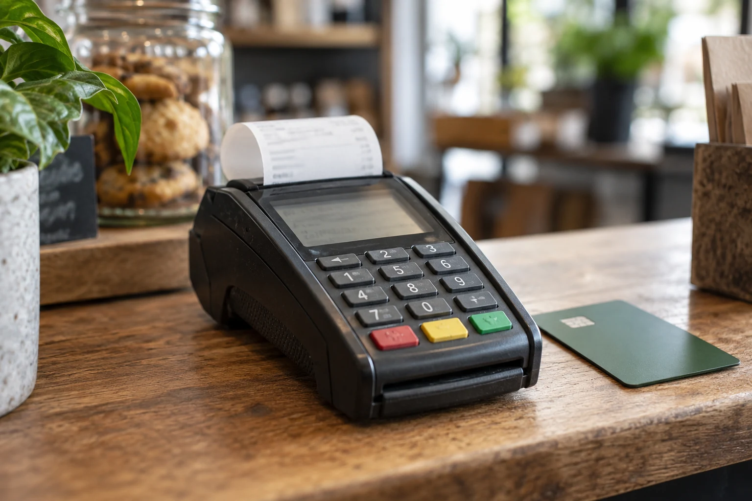

Why do customers leave my online store without completing payment?
Find the step where customers leave, then test it in Arabic and English on a phone. Check unexpected charges, unavailable delivery, forced account creation, confusing fields and payment errors. Fix one identifiable obstacle at a time and compare completed orders with enough context to avoid mistaking traffic changes for an improvement.
The key idea
A basket is a sign of interest, not a promise to buy. Investigate obstacles before assuming every unfinished order needs a discount.
Start with the step, not the explanation
Map the journey from product to basket, address, delivery, payment and confirmed order. Check that your analytics events describe these steps accurately. A payment redirect, reload or retry should not create misleading counts. Compare Arabic and English paths and phone and desktop usage separately where data allows.
Use customer-support messages and a few observed checkout sessions alongside the numbers. Ask someone unfamiliar with the shop to purchase a sample item without coaching them. Watch where they hesitate. Some people are comparing prices or saving an item for later; the investigation should distinguish shopping behaviour from a broken task.
Remove uncertainty about the complete purchase
Show what is included, the currency and the amount due. Tell customers when a delivery charge applies and how it is calculated. If the exact fee needs an address, make that clear early and display the confirmed total before payment. An unexplained increase at the final screen creates a reasonable reason to pause.
Keep variants, quantities, delivery dates and discounts consistent between basket and checkout. Explain restrictions where people choose the product, not after they try to pay. For an example, a gift needing preparation time should not appear available for every same-day slot. Specific, accurate information is more useful than a vague promise of fast delivery.
In practice · illustrative example
Inspect a failed checkout without guessing why it happened
Suppose a customer selects an item but leaves after entering an address. Delivery coverage, unexpected charges or a confusing field could be involved, but the exit alone does not identify the cause. Reproduce the journey using a representative address and the same device type. Write down the first point where a customer cannot predict the next step.
Choose one change that addresses the observed difficulty, such as showing delivery eligibility earlier. Check that the change does not create a different operational problem. Staff should still receive an address they can use, and the customer should still see the complete purchase information. Review the result against the same journey before making another change.
Turn an exit point into a testable improvement
-
Locate the step
Identify where the customer journey stops, without assuming the reason.
-
Reproduce the task
Try the product, address and device involved in the observed difficulty.
-
Change one cause
Address the demonstrated obstacle while preserving useful order information.
-
Review again
Repeat the journey and inspect its customer and staff outcomes.
Try the form as a customer would
Enter a long Arabic name, an English building name and a Kuwait phone number. Use autofill, change the area and correct a mistake. Keep useful values when validation fails. Explain errors next to the relevant field and make them understandable in the selected language. W3C’s form guidance covers identifying and explaining errors.
Ask only for information needed to fulfil the order. An optional landmark should not become a mandatory essay. If an account is required, explain the benefit and provide a usable recovery path. Where your business model permits it, assess a guest journey. Do not add a new obstacle merely to increase the number of customer accounts in the dashboard.
Reveal delivery limits while choices are still easy
Let customers check whether their area is served before they invest time in a long form. State pickup options, available slots and realistic time windows. If an address falls outside coverage, explain the reason and a real alternative rather than showing “something went wrong.”
For a Kuwait delivery example, a map point may identify the location, while block, street, building and floor instructions help the driver complete the visit. Agree which information your delivery partner actually needs. Test changing an address after selecting a slot: fees and availability should be reviewed together, not left with contradictory values.
Treat payment uncertainty as a separate problem
Use your provider’s test process to rehearse success, decline, cancellation and returning from a payment page. Check slow confirmation and closing the browser after payment. An unresolved result needs a clear status and order reference. Avoid encouraging a second payment before the first has been checked.
Ask staff to locate the attempt in the order record and explain the next step to a customer. Check that payment methods advertised on the site are actually enabled for your account. Customers should not reach the last screen to discover that the method they expected is unavailable. Investigate technical failures separately from people choosing not to buy.
Make one useful change and review it honestly
Choose a concrete issue: delivery fees displayed too late, a confusing field or lost form values after an error. Record the change and compare completion using the same event definitions. Account for campaigns, traffic mix, stock availability and seasonality. A small dataset does not support a confident claim that a redesign caused an increase.
Keep feedback close to the work. Ask support whether the same question still arrives, and check whether the change introduced a new operational problem. Recovery emails or messages should follow your agreed permission and privacy arrangements. Helping someone complete an order is useful; repeatedly chasing every abandoned basket can become unwelcome.
A worksheet for your team
A checkout improvement log
Keep the log short enough to use after each change. Record observations separately from your explanation.
| Decision | Evidence to request | What to do next |
|---|---|---|
| Observed problem | The exact field, message or missing information. | Reproduce the difficulty before changing the page. |
| Proposed change | The single obstacle the change is intended to remove. | Check the resulting order still suits operations. |
| Review outcome | The same test completed after the change. | Keep, revise or undo the change based on evidence. |
Avoid changing copy, fees, fields and payment behaviour together unless a clear problem requires it. Smaller, recorded changes are easier to evaluate.
Review checkout before buying more traffic
- Verify analytics for each step and each language.
- Show complete KWD totals and delivery conditions.
- Preserve form values and explain errors clearly.
- Test coverage, slot changes and payment uncertainty.
- Measure a specific fix alongside support feedback.
Frequently asked questions
Is every abandoned basket a website problem?
No. Customers may compare options or decide not to buy. Look for repeated friction, errors and questions before changing the checkout or offering discounts.
Should I remove every checkout field?
Keep the information necessary for payment and fulfilment. Remove unjustified fields, label optional details and test the form with your staff and delivery partner.
Will a shorter checkout guarantee more sales?
No. Clear information and dependable behaviour matter as well as length. Evaluate actual completion and customer questions after a specific change; avoid guaranteed conversion claims.
Sources and further reading
These primary sources support the specific company or platform information in this guide. Provider descriptions do not imply an endorsement by the source.
Sources checked:
Review a real checkout with GateGold
Bring an order journey, customer questions and the steps where users pause. We can discuss targeted improvements rather than assuming the entire store needs replacement.