
07Project story
Golden Messenger
Business conversations, in one familiar workspace.
Golden Messenger presents a focused mobile environment for selecting a communication number, following conversations and finding account-level messaging controls.
- Field
- Business messaging
- Experience
- Mobile application
 Inside the product
Choose a communication number
Follow multimedia conversations
Find account controls
Project story
The project, at a glance
- The user need
- Users need to recognise the right communication destination quickly.
- The interface approach
- Keep the communication interface focused on distinct destinations and readable conversation content.
- What the public screens show
- The public screens show the messaging product interface and navigation choices.
This summary is based on the project screens already published in this portfolio. Usage statistics and business performance are not reported here.
Explore the supporting screens →01 / The idea
A conversation starts with the right context.
For a business messaging tool, the conversation is only one part of the experience. The user also needs to understand which number is being used and where account controls live. Golden Messenger gives these tasks separate screens with a consistent dark visual language.
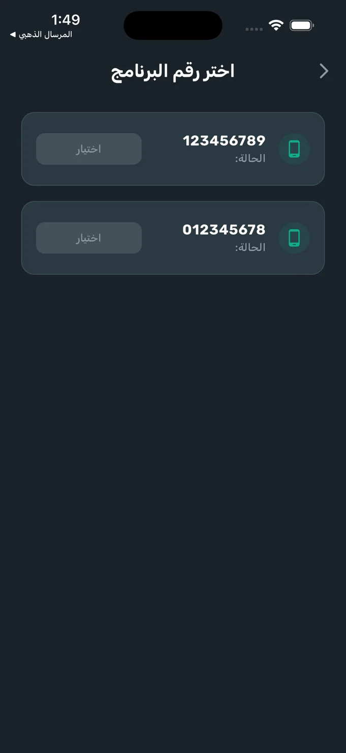
The number-selection screen presents the available numbers as individual rows with a status label and selection action. The conversation screen then shifts attention to the contact and message history, while the account screen collects identity information and messaging-related settings in one place.
02 / The experience
Let the conversation remain the focus.
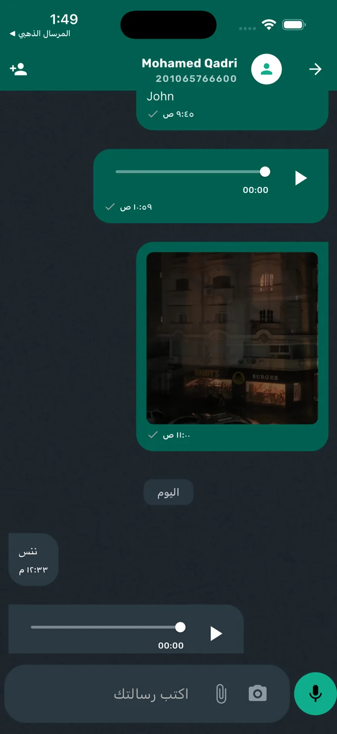
The chat view uses a recognisable pattern: the contact identity at the top, a chronological message area and a composer at the bottom. Text, image and audio messages share the same conversation, with timestamps and date separators providing context.
The dark background creates a clear distinction between the conversation surface and its message bubbles. Teal accents identify important controls without filling every part of the interface with equal emphasis. Familiar placement helps the user understand the screen without first learning an unusual navigation model.
Familiar interaction patterns give people more attention for the conversation itself.
03 / Key details
Context, conversation and control.
Explicit number selection
Available communication numbers appear with individual selection controls. This opening step makes the number context visible before the user moves into the messaging workspace.
Multimedia conversation layout
The chat screen presents text, image and audio messages with dedicated playback controls. The composer includes attachment, camera and microphone affordances beside the text entry area.
Account and messaging options
The account view groups the displayed user identity with entries for changing the phone number and scheduling a message. Support, privacy and terms destinations are arranged below those controls.
04 / The user journey
A clear route into the messaging workspace.
Identify the number
Begin with the available-number screen and use the selection action for the communication context you need.
Follow the conversation
Read the message history, inspect image messages or use the audio playback controls in the chat view.
Find the relevant controls
Open the account area for identity information, phone-number settings and the scheduled-message entry point.
05 / The screens
A closer look inside.
Explore the interface, screen by screen. Select an image to see the detail.
Number selection
A dedicated opening screen distinguishes the available communication numbers.
Inside the conversation
Text, image and audio messages appear above a familiar multimedia composer.
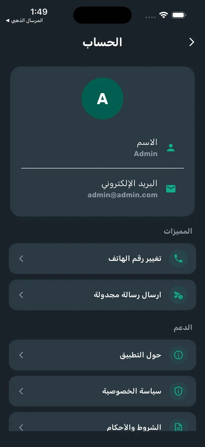
The account workspace
Identity information, messaging controls and support destinations are grouped together.
06 / The design perspective
Consistency around a familiar interaction.
Golden Messenger carries its dark palette and teal accents across number selection, chat and account settings. Each screen has a different task, but repeated shapes, typography and control placement give the product a coherent identity.
The project illustrates how a business tool can use familiar mobile conventions while keeping operational context visible. The number matters before the conversation; the message history matters during it; the account controls matter when the user needs to manage the workspace.
Let’s discuss your project