
03Project story
Golden Accounts
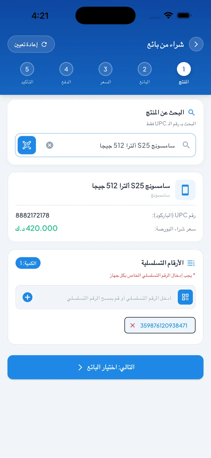
Financial detail, with a clearer daily view.
Golden Accounts brings an accounting workspace to mobile, connecting a concise financial overview with the account structure and transaction detail behind it.
- Field
- Financial management
- Experience
- Mobile application
 Inside the product
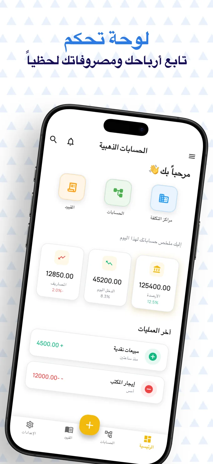
A daily financial overview
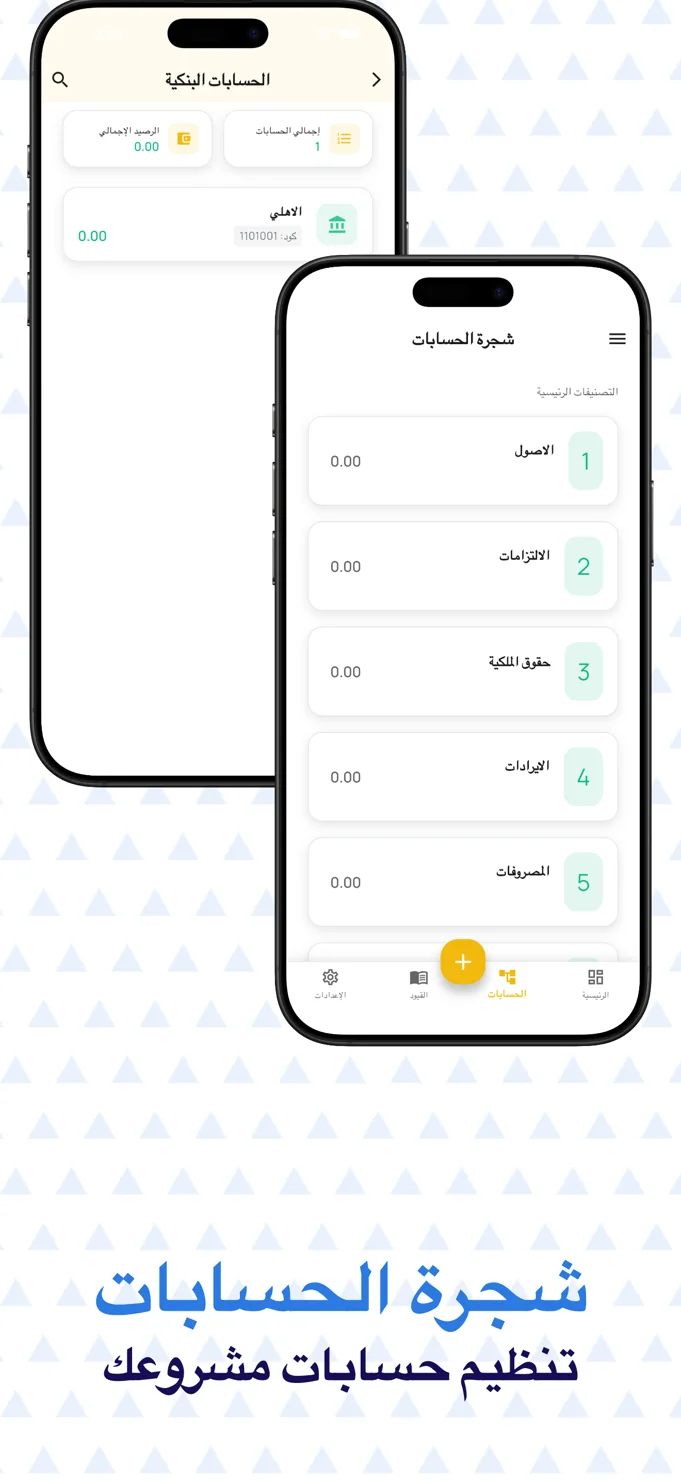
An organised chart of accounts
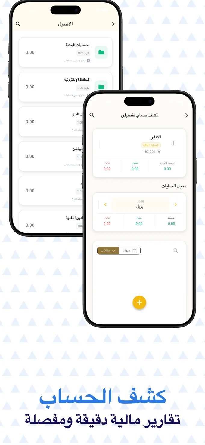
Detailed account statements
Project story
The project, at a glance
- The user need
- Business users need an organised starting point for their accounting work.
- The interface approach
- Separate destinations and readable information panels help users identify their next accounting task.
- What the public screens show
- The published interface shows the accounting product navigation and information layout.
This summary is based on the project screens already published in this portfolio. Usage statistics and business performance are not reported here.
Explore the supporting screens →01 / The idea
Start with the overview. Keep the detail close.
Financial information has two different reading modes. A business owner may need a quick view of balances and recent movements; someone reviewing the books needs the categories and entries behind those totals. Golden Accounts connects these modes in a mobile interface.
The dashboard groups balances, daily income and expenses into distinct summary cards. Recent transactions sit below them, while shortcuts lead into cost centres, accounts and journal entries. The hierarchy makes the opening view concise without treating the deeper accounting structure as an afterthought.
02 / The experience
Make numbers easier to navigate.
On a small screen, the difficulty is not simply fitting more figures into less space. The interface needs to show which numbers belong together and where the user can go for detail. Here, summary cards, account lists and statement panels each have a different role.
The chart of accounts separates assets, liabilities, equity, revenue and expenses. Within the assets view, named groups lead towards individual accounts. This progression preserves a recognisable accounting hierarchy while presenting each level in a touch-friendly list.
A useful financial dashboard provides a starting point for investigation, with an understandable path to the underlying account.
03 / Key details
Three levels of financial visibility.
Dashboard and recent movements
The opening screen brings headline figures and the latest transactions into one view. Colour and signs help distinguish incoming and outgoing movements without relying on a dense table.
Chart of accounts and bank views
Account categories use named, repeatable rows. The bank account view displays an account count and balance summary alongside the listed accounts, providing context for the selected area.
A detailed account statement
The statement screen identifies the account and separates debit, credit and balance information. A month selector and card-or-table controls show different ways to review the transaction record.
04 / The user journey
A route from summary to statement.
Review the daily picture
Begin with the dashboard’s balances, income, expenses and recent transaction cards.
Find the relevant account
Move through the chart of accounts and the appropriate category to locate an account or bank view.
Inspect the account detail
Read the statement summary and select a period or display format for a closer view of the entries.
05 / The screens
A closer look inside.
Explore the interface, screen by screen. Select an image to see the detail.
The financial starting point
Summary figures, recent movements and accounting shortcuts share the dashboard.
Structure behind the balances
Bank accounts and the chart of accounts use simple lists with clear category names.
From assets to account detail
An account statement brings balances and period controls into a dedicated review screen.
06 / The design perspective
Clarity belongs at every level.
Golden Accounts uses a light canvas, soft category colours and restrained gold accents to give numbers room to be read. Repeated cards and bottom navigation help keep the interface familiar as the user moves between overview and detail.
The project’s value as a design example lies in this continuity. A business app should make its first screen approachable while preserving the structure needed for serious work. A clear summary and a clear statement are parts of the same experience.
Let’s discuss your project