
04Project story
Golden Residence
A clearer way to discover your next stay.
Golden Residence connects accommodation discovery with the details that matter when choosing a stay: photographs, dates, room features, availability and membership options.
- Field
- Stays & memberships
- Experience
- Mobile application
 Inside the product
Discover accommodation
Explore room details
Compare membership options
Project story
The project, at a glance
- The user need
- Residents need to find relevant property and service information on a phone.
- The interface approach
- Group the recurring destinations into a mobile experience that keeps the next action recognisable.
- What the public screens show
- The portfolio demonstrates the residence product screens and their navigation.
This summary is based on the project screens already published in this portfolio. Usage statistics and business performance are not reported here.
Explore the supporting screens →01 / The idea
Let the stay take shape before the booking.
Accommodation is more than a name and a price. A guest wants to picture the space, understand what it includes and see how it fits the intended date. Golden Residence builds its mobile journey around these decisions.
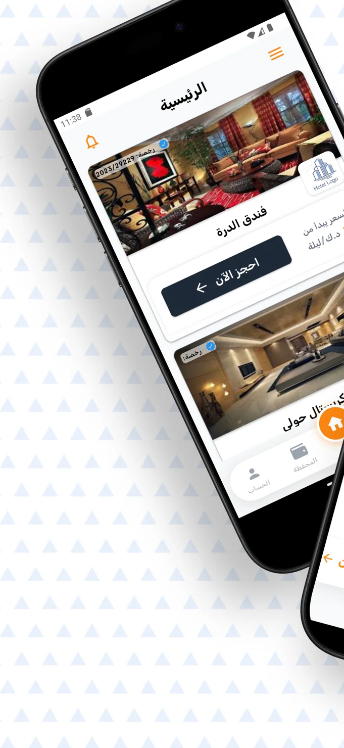
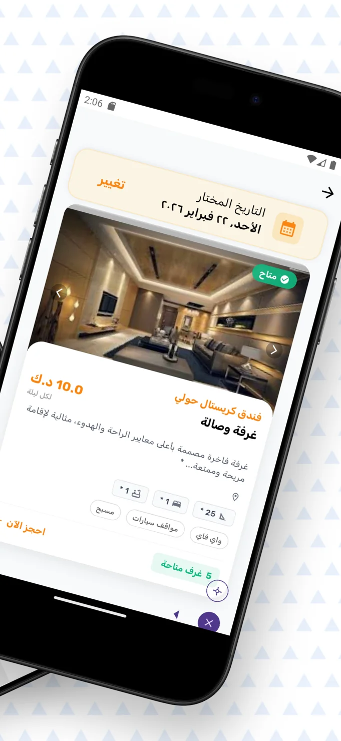
The opening screen presents hotel imagery and a direct booking entry point. A closer room view brings the selected date, photographs, nightly price, description, amenities and availability into the same context. This gives the visitor a more complete basis for considering a stay.
02 / The experience
Bring practical details into the visual story.
Hospitality interfaces often lead with attractive photographs, but the decision depends on practical information as well. The room detail screen keeps that information beside the images: room type, space, facilities and a visible availability state are part of the presentation.
Date selection appears near the top of the detail view with a change action. This placement makes the selected day part of the browsing context. The interface can tell a consistent story about a particular room and the visitor’s intended stay rather than separating those choices across unrelated screens.
A strong accommodation page helps a guest imagine the place and understand the conditions of the choice.
03 / Key details
The details that make a stay easier to compare.
Image-led accommodation listings
Hotel cards put photography first, paired with the property name and a booking action. The images communicate the setting while the repeated structure gives each option a familiar presentation.
A focused room detail view
The detail screen combines the selected date, nightly price, room description and amenity labels. A visible room-availability indicator keeps practical context close to the booking action.
Membership plans in one comparison
A dedicated plans screen presents membership options with durations, displayed prices and wallet-related information. Monthly and yearly controls provide a clear starting point for comparing the available plans.
04 / The user journey
From the first photograph to a considered stay.
Explore the accommodation
Browse the hotel cards and open an option that matches the kind of stay you have in mind.
Review the room and date
Check the selected day, room photographs, facilities, displayed price and availability information.
Continue with the right context
Move towards booking or compare membership plans through their dedicated screen and billing-period controls.
05 / The screens
A closer look inside.
Explore the interface, screen by screen. Select an image to see the detail.
Accommodation at a glance
Hotel photographs, property names and booking entry points lead the home screen.
The room in detail
The selected date, images, amenities and availability are presented together.
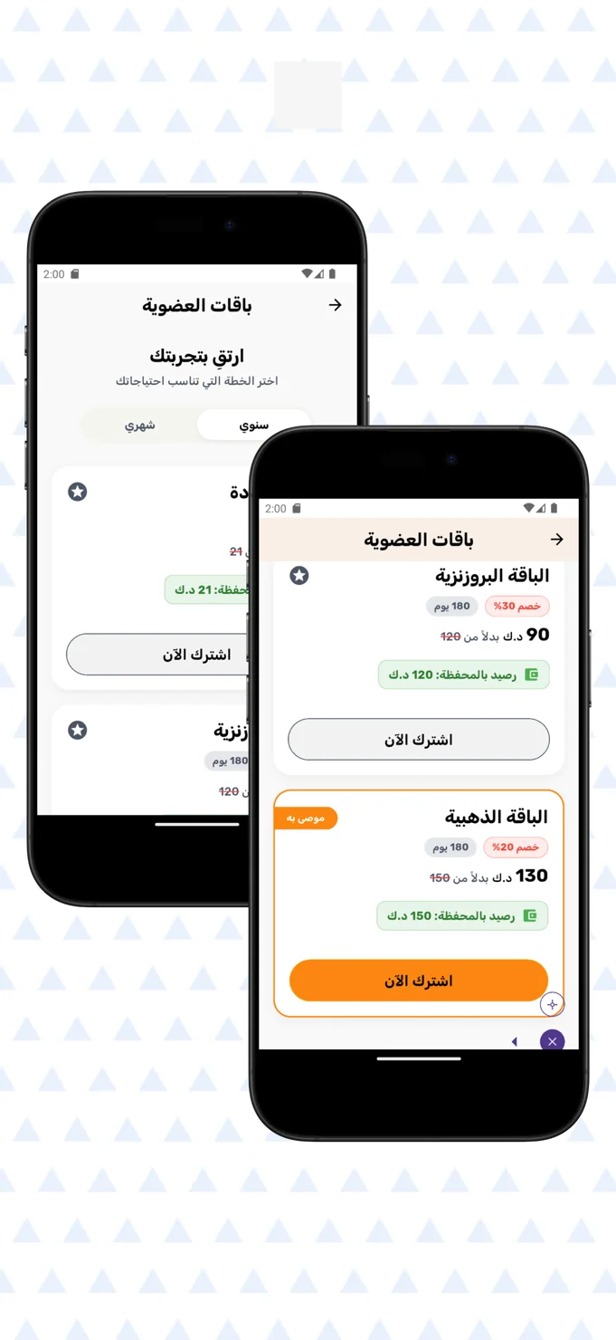
Membership comparison
Plan cards organise membership durations, prices and wallet-related details.
06 / The design perspective
Give the decision room to breathe.
Golden Residence uses generous photography, light surfaces and warm orange accents to balance atmosphere with practical information. The design lets the visitor see the setting while keeping date and booking controls recognisable.
For a hospitality product, this balance is essential. Discovery should feel inviting, and the next step should feel understandable. Bringing images, room details and availability into a coherent sequence helps the guest approach a reservation with a clearer picture of the stay.
Let’s discuss your project