
05Project story
MedPulse Academy
A learning journey that stays organised.
MedPulse Academy brings subject discovery, recorded lecture navigation and a personal library into a mobile learning experience designed around the student’s next step.
- Field
- Digital learning
- Experience
- Mobile application
 Inside the product
Explore medical subjects
Follow a lecture syllabus
Return to your library
Project story
The project, at a glance
- The user need
- A healthcare journey needs clear information and an understandable next step.
- The interface approach
- Use a consistent mobile structure and distinct service destinations to reduce the effort of exploring the available options.
- What the public screens show
- The public screens demonstrate the healthcare interface and its visual hierarchy.
This summary is based on the project screens already published in this portfolio. Usage statistics and business performance are not reported here.
Explore the supporting screens →01 / The idea
Connect the course catalogue to daily study.
An education platform has to serve both the new visitor choosing a subject and the returning student continuing a course. MedPulse Academy connects these two moments through a subject catalogue, detailed course pages and a personal academic library.
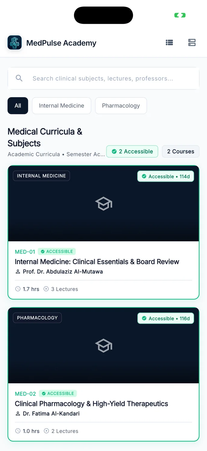
The catalogue groups medical subjects with search and specialty filters. Course cards show the subject, instructor, lecture count and study duration. Access information appears alongside the course identity, giving the student a clear view of what can be opened before entering the learning material.
02 / The experience
Keep the learning path visible.
The central interface question is how to make a substantial body of teaching material feel navigable. A student needs to understand the syllabus, find the next lecture and return to the same subject later without starting the discovery process again.
The subject page brings an overview, instructor identity, access status and recorded lecture list into one sequence. In the personal library, progress indicators and resume controls shift the emphasis from choosing a subject to continuing it. Each screen supports a different moment in the same learning journey.
Discovery introduces the subject; a well-organised library makes it easier to return to the work.
03 / Key details
Three connected parts of the learning experience.
Search and specialty discovery
The catalogue combines a search field with subject filters such as internal medicine and pharmacology. Course cards provide enough academic context to distinguish the available material at a glance.
Subject overview and lecture navigation
The detail view introduces the subject before presenting its recorded lectures. An access panel and player entry point sit above the syllabus, making the continuation into teaching material easy to identify.
A personal medical library
Accessible subjects are grouped in a dedicated library with remaining access time, syllabus progress and resume controls. The presentation gives returning students an alternative to searching the catalogue again.
04 / The user journey
Discover a subject. Build a study rhythm.
Find the relevant subject
Search the catalogue or use a specialty filter, then compare the course information on the subject cards.
Review the curriculum
Open the subject overview, inspect its lecture list and use the player entry point for accessible material.
Continue from the library
Return to the personal library to see accessible subjects, review progress and resume the learning path.
05 / The screens
A closer look inside.
Explore the interface, screen by screen. Select an image to see the detail.
The medical subject catalogue
Search, specialty filters and detailed cards support course discovery.
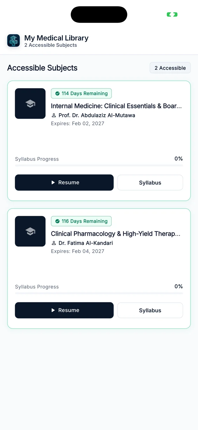
A library for returning students
Accessible subjects appear with progress, access information and resume controls.
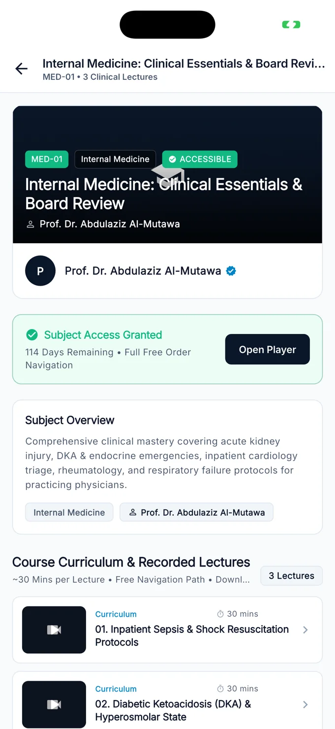
Inside a subject
An academic overview leads into the curriculum and recorded lecture list.
06 / The design perspective
A calm interface for focused learning.
MedPulse Academy uses a restrained dark-blue and green palette with light content areas. The visual hierarchy distinguishes the subject identity, access state and study actions, helping academic information remain readable on a small screen.
The project demonstrates how a learning platform can organise content around repeated use. Course discovery matters, but so do the moments after enrolment: finding a lecture, checking a syllabus and returning to a subject. A consistent structure connects these tasks into one experience.
Let’s discuss your project